26.5.09

Cool Business Card Ideas


Cool Business Cards

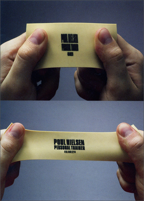
You've probably come across this page if you've looked around for some inspiration in this area but I thought i'd share with whoever hasn't

some fantastic and clever business cards on this page.

can't see many of them coming cheaply thought...

17.5.09

Team Fortress 2 -Meet the Spy


Team Fortress 2 is a fun online multiplayer, for most consoles and PC.
I decided to share this video with you because I think it's a brilliant play on Character traits and development.

The game is broken down into a bunch of characters, Soldiers, Heavies, Scouts, Spies, Medics etc and each has their own cliche'd but amusing traits.

I know i'm talking about a computer game but I still feel like these teaser trailer videos are still impressive pieces of design work.

Synechdoche, New York


I went to see this movie at the Cornerhouse on Friday after seeing the trailer on the web a few months ago.
First thing I can say about this film is, "what the heck?''
After watching it and having no clue as to what I just saw I went to consult the internet.
Apparently, Charlie Kauffman intended the film to be completely illogical and expects the viewer to not take anything at face value. A lot of people on messageboards claimed theories which seemed unbelievably far-fetched and bizarre but I guess that's the point of personal interpretation.
I can't say I enjoyed the film after seeing it, after reading about it though I could start to appreciate some of the feature of the film a little more.
Cotard, the surname of the anti-hero, is the name of an actual illness, Cotard's Syndrome, which the sufferer believes they are dying (to simplify). An obvious link there.
Other elements of the movie, such as the house on fire seem less obvious and at first glance, look to be metaphorical for something...until something else happens which completely contradicts what you first thought.

Strange, strange film.
Go see it.

Science Museum - DVD Booklet


This booklet was created as an afterthought to accompany the DVD, like you'd find in a 'real' DVD case.
The idea of the booklet was to contain the scripts so the viewer could follow along to the animations narration.
Also to explain a little more about some of the terms and theories contained in the pieces.
The text is as simplified as possible, bearing in mind the target audience and each page is illustrated to continue the theme of the whole project.

On reflection the booklet seems like a crucial element of this project. Looking back at the animations, the narration is a little fast so creating an accompanying booklet which contains the scripts does seem very useful and appropriate. Also I feel like it adds a little to the aesthetic of the DVD as a whole and makes the whole project seem more "polished".

Science Museum - DVD


At the very end of the Science Museum project I wanted to to round it all off with a decent presentation of the final piece so I decided to make a proper DVD case and disc cover image, just to keep the style of the project intact in every aspect.
The images are all recycled from parts from each video.

16.5.09

What's In The Box


Pretty much one of the best student films ever.

Music's taken from Lost and the visual and plot are more than reminiscent of Half Life 2 but Hot Dang it's well made

Science Museum- Logo Development

NORMAL

ELECTRICITY

SMOKE/STEAM

NATURE

SPACE/ASTRONOMY


These Logo development videos were made after showing my tutor the final Time Travelers Guide animations.
He suggested I develop the logo a little more which I felt was a good idea because it meant that I could create a few more pieces of motion work for the project without spending even more time on a project that's been going on for five months.

The videos are, I would say, pretty self explanatory. The idea was to replace the particles from the NORMAL video with different elements and colour schemes to match a variety of different fields of science.
Overall I was very pleased with the results. They were simple but I think effective. Each piece shares the similar theme of the round logo but still looks different enough to work as individual pieces.
I was most pleased with the Astronomy, Nature and Steam videos only because I got to replace the pink dots with custom particles which I created in Photoshop and they ended up working nicely.

Science Museum- Short Stories

SPAGHETTIFICATION


THE NEUTRON STAR


The two short stories were created before the two Time Travelers Guide videos. After presenting the animatics for the two Time Travelers Guide videos, the tutors felt like it was a little too much work to undertake to create two polished and finalised pieces of work and recommended I create two shorter videos that were more 'finished'.
As a result, "Spaghettification" and "The Neutron Star" were created.
They were made in the style that I wanted to create the Time Travelers Guide videos so I think that helped in my decision to go ahead and make them, once some of the templates for the box had been created it became a lot easier, but still laborious.

The two videos were based around some facts I found about some of the mysterious elements of our Universe, Black Holes and Neutron Stars. They are supposed to be short, simple and sweet. Like a taster, to get you interested. I'm quite pleased with the result. The camera blur I added to add some realism however I'm not sure if it works or not and a little wiggle expression added to the camera was supposed to make it appear hand-held.

Science Museum - Time Travelers Guide

HOW TO VISIT THE FUTURE


HOW TO VISIT THE PAST


These are the two main final pieces for my Science Museum Black Holes brief.
A lot of time and effort was poured into these animations.
The idea of the pieces was to use Black Holes as a starting point to get young children interested in science, so I felt that the best feature of black holes is the possibility to use them for traveling through time and so, the Time Travelers Guide was born.

The aesthetics were created to resemble a box, using a very cardboard and paper textured theme because I felt that children of that age range would be familiar with them through Arts and Crafts lessons from school.
The narration is a little quick merely due to time constraints and also because it's the simplest I could make the script.
I didn't want to over-simplify the idea of how to travel through time because part of the magic of time travel is understanding the ideas behind it.
The animation is supposed to appear very natural. The characters and objects that are animated on screen are meant to appear as though they are being physically manipulated by people outside the frame using lollipop sticks.

Overall I'm pleased with the result. I'm definitely glad I didn't leave the pieces as animatics because I wanted to create at least one piece of work this year that I could say I was proud of.

Scratch Me


Bizarre yet beautiful piece of work.

Check out Nico Casavecchia 's site:
Linky winky

bydiddo wetsuits


i don't surf or wear wetsuits as fashion accessories but these by bydiddo have to be some of the coolest i've seen:

bydiddo

15.5.09

Dan Vojtech


just stumbled across this brilliant photographer.
check it out:
dan vojtech

14.5.09

Landscapes 2.0

Every now and then I have a flick through this website and just really marvel at some of the stunning places that people have found and photographed, all over the world.
Check it out:

Landscapes 2.0

GingerBeards


Often the ginger have been bullied about their unfortunate pigmentation.
At least there are a few out there who embrace this genetic defect and say, "Hey, look at me, I'm proud to have a ginger beard":

++GingerBeards++

Texture People - New Project

When I posted some of the images from My Texture People set I'd created it inspired me to start a new project using the same techniques. (They sure are laborious to make!)
I decided this time instead to make a series of images using screenshots from some of my favourite films.
I'll share the first one with you now:


CJ Mats LTD

My girlfriend's stepfather wanted the whole shebang when setting up his new business. The website was under construction but he wanted flyers, letterheads, business cards, the lot.
While they may not be great I still took it as an opportunity to put what I knew so far into practice and also, to deal with a "client".
Here's some development work from the business cards:


The logo from the last business card is the one they ended up running with.
Which was nice.

C.J Mats LTD


C.J Mats LTD is a website I created for my girlfriend's step-father.
He and a relative set up their own business selling stable mats and required a website.
I'd never done a website entirely by myself before.
I understand HTML and a little CSS from messing around with blogs like this one but never built an entire site from scratch.
No templates or anything.
Luckily it went alright and while it may not be a design masterpiece I'm still quite happy with how it turned out, function wise at least.
If you for some reason need to visit the site (perhaps to buy some mats) you can find it here:

cjmats.co.uk

Alex Ostrowski


Alex Ostrowski was giving a talk at Salford University. Luckily he had just about enough time to visit us on his way back to catch his train. He brought a big box full of his work and laid them out very nicely across two tables to show us.
He is mainly an illustrator and only graduated last year but has already managed to land himself a place working at YCN.
He was quite a good person to give a talk, obviously only a year older than most of us there was no generation gap or other factors which created a big difference between us and him.
He showed us a lot of his work and talked about the idea behind them while also telling tales of his times trying to find a job.
He was quite down to earth and suggested that that's probably the best way to go about selling yourself.
A good piece of advice he gave was to try and not use too many gimmicks, they can often work against you when trying to apply somewhere.
He said that he only went after the jobs he wanted, the companies that he wanted to work for, which seemed like a fairly obvious but often overlooked piece of advice. I can understand that trying to get your foot in the door may be so difficult that people will often stray into places they don't want to be, just to get in the industry.

A few of us asked some questions about his personal experiences so far but the talk was cut very short when Alex realised he'd missed his train.

whoops.

13.5.09

MY TEXTURE PEOPLE

My Texture People is a sort of project I have been working on for some time.
I find photos I like and "Texturise" them using textures and stuff of my own or images from Google.
I don't know what it is I like about them. I just like making them and replacing everything about a person with some stock images.
Anyways, here's a selection of some of my favourites:


Cells Going Bad

Cells Going Bad is a video I created following a 3D tutorial. I always wanted to make something 3D, it always seemed so complicated, even though there's only one extra dimension it seems like there's so many more things to think about.
I found this Cells Going Bad one and immediately knew I had to give it a go. I love House! it's a brilliant show and coming across this tutorial was perhaps perfectly coincidental..but I like to think otherwise.

mjkov.com swoosh

I found this cool "speed particles" tutorial online that I had emulated to make this piece for fictional website "mjkov.com".

Since creating this piece I've found that I have adapted it in one way or another in a few of my own pieces of work.

Final Day on Earth


This video was made following a tutorial at the beginning of the Science Museum Black Holes brief. When I saw it I though,
"hmmm.. I could possibly adapt and include this somehow".
In the end I never did but felt I'd still share it anyways..

Adrian Shaughnessy


Adrian Shaughnessy is a self taught designer who has become equally well known for his books about design.
His book, How To Become A Graphics Designer, Without Losing Your Soul,
is one I have personally bought and enjoyed. Much like the Si Scott talk, Adrian was more keen on telling us about the nitty-gritty than merely showcasing his work.
His talk was more about three main bullet points,
• Cultural Awareness
• Communication
• Integrity
As he expanded on these points he told some anecdotes to give a better understanding of what he meant.
It was interesting that Adrian is a self taught designer yet still understands so much about design, the relationship between designers and clients, the purpose of design, the role of the designer, etc.
It really made me think that just because you have a piece of paper saying you have graduated, doesn't necessarily make you a designer. It's this role we have to 'become' in the real world than something we can just earn.

Jonathan Barnbrook


Unfortunately on the day of Jonathan Barnbrook's talk I was under then impression he was doing two of the same talks during the day so I missed the first one.

However, the second one proved to be a very enjoyable one, specifically aimed at us third years which I felt was very nice of him to do.
Jonathan Barnbrook had a good sense of humour which was evident in his talk and it also transposed well into his work.
The purpose of this talk was to help us figure out what the heck we were supposed to do and what we should expect to face once we left University.

Here are some of what I considered to be Barnbrook's Greatest Tips:
• Don't make briefs sound boring.
• A restriction might not be a bad thing.
• Design is not a "traditional industry".
• Don't get distracted.
• Learn how to make decisions.
• Get an accountant!
• Charge what you think you can get away with.

One of the things I most admired about Jonathan was his moral stance on design. He's refused to work with Coca-Cola and several other companies solely because of their views and actions regarding the environment.
This merit of his proved especially impressive when he told us he turned down a hundred-thousand pound offer to drive a Japanese car around for a year. (No design work even involved)
phwoar!

Si Scott


Si Scott is a designer/illustrator whose work I had come across in the past and greatly admired.
It took a few minutes on the morning of his talk before I realised who he was, when his name was mentioned as being the day's guest speaker.
Needless to say I was pretty excited. While the Johnny Hannah talk was good to attend, not because I enjoyed his work but because it proved an interesting insight into his life as a practicing illustrator I hoped that I could get a similar experience from a designer whose work I really enjoyed.
Here's some of the points I made during his talk:
• Si won a D&AD Newblood award while in his final year at University.
• He found himself moving back and forth between London and the North.
• Got made redundant a lot.
• He enjoys spending a lot of time on his work.
• He's illustrated lamps, opera posters, pieces for Swedish transport and Notion Magazine.
• 90% of his work is hand drawn, the remaining 10% is scanning the piece in and some minor touch ups.

I really enjoyed this talk, Si was very down to earth and took a less than formal approach to his presentation often digressing for ten minutes to tell us a story of something that has happened to him in his working life so far, which I though was great. It was much better for us to get the nitty gritty stuff than the so-called "Do's and Don'ts" which can often be the case.

12.5.09

Paul Farrington


Paul Farrington of Studio Tonne came into speak to us about his work and the stuff he likes.
Paul attended the Royal College of Arts for 2 years and went on to found Studio Tonne.
What I immediately noticed were similarities between Paul's work and Matt Pyke's who had already visited us.
Both were very computer literate, making pieces of "generative" design. Work that responds to the viewer and produces different results each time. Paul Farrington's work contained a lot of "toys" which were Flash created programs that were mainly related to sound. A lot of his work drew links between the two fields. The toys were completely editable. The user could manipulate tracks, volume and vary the sounds being created entirely.
This was a continuing theme I noticed in the majority of Studio Tonne's projects, they were predominantly interactive based designers. Seeing a lot of their work in the context they are supposed to be seen in, for example the interactive fish tank, makes you realise that there is more to interactive design than just being something you interact with (sounds stupidly obvious).
The fish tank was commissioned by the NHS for the children's ward in Derriford Hospital. The idea of interacting with the fish is used as a distraction from the reality of being in a hospital, it brings about a smile on the face of an otherwise worried child.

Matt Pyke


Matt Pyke came all the way from Lovely Sheffield (is it me or does everybody seem to come from Sheffield these days?)
to give us a talk about himself and his company, Universal Everything.
Before the presentation myself and a few other lucky D&AD students got a chance to meet with him first to get a sort of pre-talk talk.
He spoke to us a little about himself but kept it brief knowing we were going to be going over the same things later that same afternoon.
Instead the floor was more open for us to ask him questions. David Crowe opened the floodgates by asking him about his methods. This turned out to be the most interesting thing that Matt Pyke had to say all day (that isn't supposed to sound as negative as it does, he was actually a lovely chap). I really did enjoy Matt's methods, his ideas all stem from a single sketch he will doodle on the closest piece of paper or tissue and it all goes from there.
While Matt rarely creates the final pieces himself it is his ideas which make Universal Everything the broad and talented agency it is.
My favourite work of the day was the Nokia commissioned "Beautiful Connections" piece which saw a load of black and white balls being attracted to the colourful ones. While the work itself was nice, it was the story of its creation which really inspired me. Apparently, the balls were an idea Matt had scribbled on piece of paper which he then commissioned a 16 year old Serbian boy, that he discovered on the internet, to actually make! The soundtrack was also an opera singer's audible response to the piece when it was played to her.

Matt Pyke's ideas are the foundation of the aptly named Universal Everything. Each piece of work the company produces seems to involve at least a dozen different people every time.

Johnny Hannah


Johnny Hannah came in to kick start the year's series of guest speakers.
The talk was a typical portfolio show.
While I'm not keen on his work at all, I don't want to appear critical in any way. It's just my personal taste.

At the same time, I could appreciate his passion for his style, it is one he has maintained and it has brought him
a constant flow of admirable clientele.
Hannah works freelance, often for customers both sides of the 'Pond'.
What struck me most was the demographic which were most exposed to his work. Hannah's clients were notably high-brow newspapers, old time jazz albums and Shakespearean book covers.

9.5.09

Dionysos - Tais-Toi Mon Cœur

I don't know much about this piece of animation or the creator, apart from him possibly being French.
Anyway, here it is:

And here is a link to his/her website:
http://www.patapasteque.com/